India
 Global
 UAE
 Nigeria
 Singapore
 Kuwait
 Monaco
 Qatar
 Belgium
 Netherlands
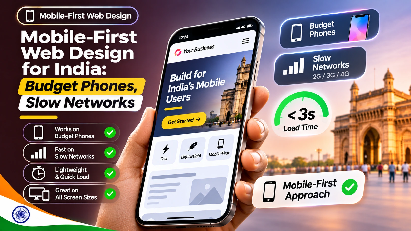
Short answer: Mobile-first web design for India means designing for an entry-level Android phone on a patchy connection first, then adding detail for bigger screens. In practice: a hero that renders within 2.5 seconds (LCP), taps that respond within 200 milliseconds (INP), stable layouts, and lighter pages when a visitor has turned on Data Saver. Google's web.dev thresholds give you the targets.
Key takeaways
- Google treats LCP of 2.5 seconds or less, INP of 200 milliseconds or less and CLS of 0.1 or less as good, measured at the 75th percentile of real visits.
- On budget phones the slow part is often the processor, not the network, so heavy JavaScript hurts INP even on decent 4G.
- The hero image or headline decides LCP. Design it to load first and never lazy-load it.
- Build the light version by default, then use the Save-Data signal, where browsers send it, to trim images and fonts further.
- Test with Chrome's calibrated low-tier mobile CPU preset and with a real low-cost phone, not only a fast laptop.
Why does mobile-first web design for India start with the cheapest phone?
Because that phone sets the floor. A shopper in Pune paying by UPI on an entry-level Android, or a commuter on a crowded Mumbai local with one bar of signal, sees the same site you approved on a large office monitor. If it works for them, it works for everyone.
Google's own threshold research says most Core Web Vitals targets were set based on what is achievable on mobile, the more constrained case, and the same thresholds then apply to desktop (web.dev, How the Core Web Vitals thresholds were defined, 2025). The INP guide adds that device capability is more likely than network conditions to expose slow interactions (web.dev, Interaction to Next Paint, 2025). So a page can download quickly on 4G and still feel sluggish because a low-cost processor is busy running scripts.
What Core Web Vitals targets should designers work to?
Layout, imagery, fonts and interaction choices drive much of the result. The thresholds below come from web.dev and are assessed at the 75th percentile, so three in four visits should meet them (web.dev, 2025).
MetricGoodPoorDesign decisions that move it Largest Contentful Paint (LCP)2.5 s or lessOver 4 sHero size and format, web fonts, what appears above the fold Interaction to Next Paint (INP)200 ms or lessOver 500 msCarousels, mega menus, filters, chat widgets, animation on tap Cumulative Layout Shift (CLS)0.1 or lessOver 0.25Reserved space for images, banners, cookie notices and ads INP replaced First Input Delay as a Core Web Vital in March 2024, per web.dev's launch post (2024). If your agency reports still mention FID, they are out of date.
How do you design a hero that loads fast on a slow network?
web.dev splits LCP into four sub-parts: time to first byte, resource load delay, resource load duration and element render delay. Its guide suggests roughly 40% of the time for the server response, 40% for downloading the resource, and under 10% each for the two delays, as guidelines rather than rules (web.dev, Optimize LCP, 2025). Design choices mostly affect the last three.
Hero rules that hold up on budget phones
- One hero image, not a slider. A carousel loads several large images and adds script. One well-cropped image or a strong text headline is lighter and easier to read.
- Put the hero image in the HTML. An image set as a CSS background or injected by JavaScript is found late. Ask developers to add
fetchpriority="high"to the one image most likely to be the LCP element. - Never lazy-load the hero. The web.dev guide is explicit that lazy-loading the LCP image adds avoidable delay. Lazy-load images further down the page instead.
- Consider a text-first hero. A headline in a system font can become the LCP element and paint almost immediately, with the image arriving after.
- Size images for the screen. Provide responsive sizes so a 360-pixel-wide phone does not download a desktop banner.
How do you keep INP low on low-end Android phones?
INP measures the delay between a tap, click or key press and the next visual update, and reports close to the worst one in a visit (web.dev, 2025). Scrolling and zooming are not counted. On a budget phone the usual cause is a long task: any piece of JavaScript work that runs for more than 50 milliseconds and blocks the main thread (web.dev, Optimize long tasks, 2024).
Designers can reduce that work before a line of code is written:
- Give instant feedback on every tap. A pressed state on "Pay with UPI" or "Add to cart" should appear at once, even if the next step takes a moment. Do not wait for a network round-trip to change the button.
- Question every widget. Chat bubbles, review carousels, pop-ups and tracking tags each add script. Keep the ones that earn their place on the page that matters.
- Prefer simple filters over animated panels that re-render hundreds of product cards.
- Keep menus shallow. A two-level menu with plain transitions is faster to open than a heavy mega menu with images.
For developers, the same guide recommends breaking long tasks up and yielding to the main thread, for example with scheduler.yield(), which it lists as available in Chrome and Edge 129 and Firefox 142 but not Safari, with a setTimeout fallback elsewhere.
Which data-saving patterns should Indian websites support?
Visitors on prepaid data packs or a weak signal gain the most from a page that is light by default, so start there. On top of that, a browser can tell your site that the user wants to save data: it sends a Save-Data: on request header, and pages can read navigator.connection.saveData in JavaScript. web.dev's guide to the header dates from 2016, and MDN now marks Save-Data as experimental with limited availability, so check your own server logs to see how many visitors actually send it (MDN, Save-Data header).
The patterns in web.dev's Save-Data guide still translate well into a design spec:
- Serve 1x images instead of high-density versions when Save-Data is on.
- Drop decorative images and fall back to system fonts instead of custom web fonts.
- Show fewer items per load, such as shorter product grids or smaller previews, without removing functions.
- Have the server send
Vary: Save-Dataso caches do not hand the light page to everyone, or the full page to people who asked for less.
You can add your own rules on top: no autoplay video, posters instead of embedded players, and a clear "load more" rather than infinite scroll. MDN describes effectiveType (slow-2g, 2g, 3g or 4g, estimated from recent round-trip time and bandwidth) as having limited availability across browsers, so treat it as a hint and never as the only switch (MDN, NetworkInformation.effectiveType).
Which heavy patterns have lighter alternatives?
Common patternWhy it hurts on budget phonesLighter alternative Auto-rotating hero sliderSeveral large images and timers compete for the first renderOne hero image or a text-first hero Two or three custom web fontsExtra downloads and late text swapsOne font family, or system fonts for body text Background video on the home pageUses data and processor time before any actionA still image with a tap-to-play option Chat widget loaded on every pageLarge script on the main thread during loadA WhatsApp or chat button that loads the widget only when tapped Infinite scroll on product listsGrowing page, heavier interactions over timePaged lists or a "load more" button Pop-up on arrivalLayout shift, extra script, blocks the taskAn inline banner with reserved space If an existing site is built around several of these, a phased website redesign often works better than patching one widget at a time, and our earlier look at website development trends for Indian businesses in 2026 covers the wider build choices.
How should you test like a real Indian user?
Lab tests on a fast laptop flatter almost every design. Chrome DevTools, from Chrome 134, can calibrate CPU throttling to your machine and create "low-tier mobile" and "mid-tier mobile" presets; the Chrome team suggests mid-tier as typical and low-tier for the slowest devices, and the Performance panel can compare your trace with real-user data from the Chrome UX Report (Chrome for Developers, 2025). The same post notes that throttling does not simulate GPU, memory or thermal limits, so a real phone still matters.
- Buy or borrow one low-cost Android phone and keep it as the team's test device.
- Review every design on it over mobile data, not office Wi-Fi.
- Run DevTools with the low-tier preset on the key journeys: home, category, product, cart and UPI checkout.
- Check field data (Search Console or a real-user monitoring tool) monthly, and around festive sales when traffic and device variety peak.
Our website UI/UX design team at Alive Inc. reviews layouts against these budgets, and the website speed optimisation service measures where time is actually lost before anything is changed.
What mistakes do teams make most often?
- Approving designs on desktop first. Review the phone version first, at real size, with real copy in Hindi or regional languages where you use them.
- Reading one PageSpeed score. A lab score is a single run. Core Web Vitals are judged on the 75th percentile of real visits.
Frequently Asked Questions
What is a good INP score for a mobile website?
Google's web.dev guidance treats an Interaction to Next Paint of 200 milliseconds or less as good, more than 200 up to 500 milliseconds as needing improvement, and above 500 milliseconds as poor. The score is judged at the 75th percentile of real page visits, separately for mobile and desktop.
Does mobile-first design mean a separate mobile website?
No. Mobile-first design means you plan the layout, content and performance budget for the smallest, slowest likely device first, then enhance for tablets and desktops within one responsive site. A separate mobile site doubles maintenance and is rarely needed for a modern business website.
How do I know if my visitors use Data Saver?
Browsers that support it send a Save-Data request header, which your server logs can record, and the same preference is readable in JavaScript where the Network Information API exists. Support is limited and the header may be rare, so count it for a month, and keep the default page light whatever the result.
Which page should I fix first?
Start with the page that carries the most revenue or leads, usually a product, category or service page reached from search or ads. Check its field data for LCP and INP, fix the largest cause first, then move to the next template rather than polishing the home page alone.
Sources
- web.dev: How the Core Web Vitals metrics thresholds were defined (2025)
- web.dev: Interaction to Next Paint (INP) (2025)
- web.dev: Interaction to Next Paint becomes a Core Web Vital (2024)
- web.dev: Optimize Largest Contentful Paint (2025)
- web.dev: Optimize long tasks (2024)
- web.dev: Delivering fast and light applications with Save-Data (2016)
- Chrome for Developers: More accurate DevTools performance debugging using real-world data (2025)
- MDN Web Docs: NetworkInformation.effectiveType (2026)
- MDN Web Docs: Save-Data header (2026)